Viable Community
Timeline
Oct 2025 - Jun 2026
Role
Product Designer
Tools
Figma, Magic Patterns, Figma Make
Deliverables
UX research, Storefront Landing page
Outcome
From no brand to a trust-first product card
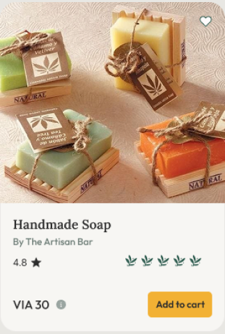
The team researched 11 competitors, including No Plastic Please and Ecomondo among the ones I covered, and turned that into a validated persona and positioning statement that every downstream design decision got tested against. The product card redesign that came out of it closed the trust gap directly: vague "eco-friendly" claims became scannable, glanceable proof shoppers could take in within a second.
Problem
Building brand identity from scratch
No visual identity, no brand system. Viable Community had a rough idea of who they were selling to, but nothing concrete to design from.
No audience data to anchor decisions. The lack of a demographic made it hard to know how to present their products.
My Role
Grounding the work in the market
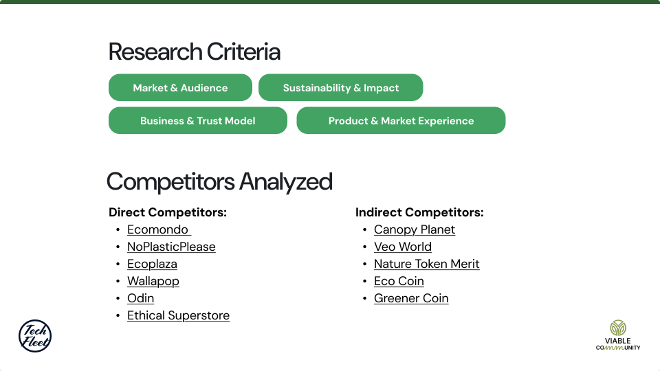
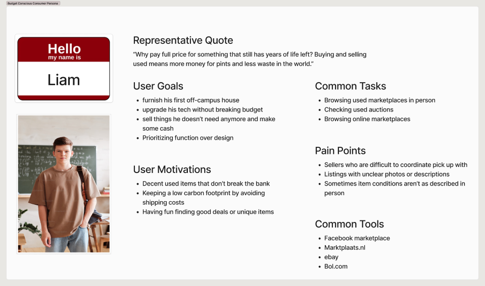
I researched competitors including No Plastic Please and Ecomondo, as part of the team's broader review of 11. I also led persona construction in Phase 1, researching across four criteria: market and audience, sustainability and impact, business and trust model, and product and market experience. That foundation carried into Phase 2, where I translated the findings into the storefront landing page and product cards, and defended those decisions in stakeholder reviews.
Product Decisions
Phase 1: Research & Persona Construction
I researched competitors including No Plastic Please and Ecomondo, as part of the team's larger review of 11. I looked at four criteria: market and audience, sustainability and impact, business and trust model, and product and market experience.
Product Decisions
A positioning and a behavior to design around
A positioning to build the brand voice around. Verified, affordable, community owned, trust first. Every visual and content decision in the redesign had to reinforce that Viable wasn't just another ethical marketplace, but one people could actually trust and afford.
A behavior to build the interface around. People were scanning and comparing, not reading. That meant the storefront needed to work at a glance, not reward slow reading.
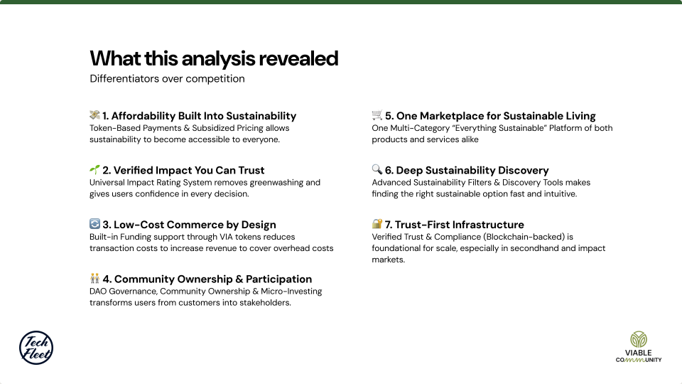
A real market gap. Sustainable platforms were fragmented by category, sustainability itself was priced as a premium, impact claims were hard to trust because of greenwashing, and no platform gave its community real ownership or a voice.
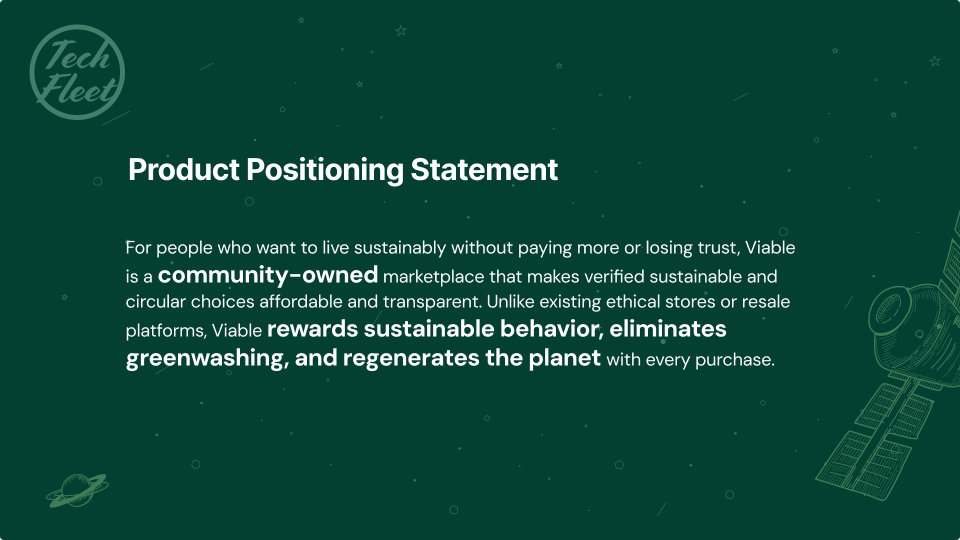
A positioning to build the brand voice around. Verified, affordable, community-owned, trust-first. Every visual and content decision in the redesign had to reinforce that Viable wasn't just another ethical marketplace, but one people could actually trust and afford.
A behavior to build the interface around. People were scanning and comparing, not reading. That meant the storefront needed to work at a glance, not reward slow reading.
Phase 2 solution
Card shape
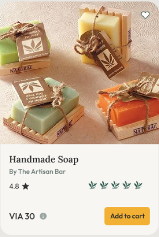
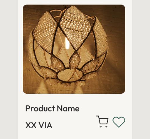
The research pointed to a trust problem: vague "eco-friendly" claims with no evidence, read by shoppers who scanned instead of reading.
Before
After
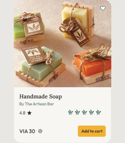
Tried: a card with a description, certifications, and a seller bio for more information to prove trust.
Result: it read as more credible in isolation, but fell apart in context. Next to nine other cards in a scroll, the extra text slowed the scan down.
Fix: cut to two signals readable in under a second and comparable at card size, a star rating and a leaf based sustainability score.
Kept: seller attribution, but smaller, for provenance without competing for attention.
Moved: everything else to the product detail page, where someone who's already stopped scanning is willing to read. The card ended up deliberately smaller than a "complete" listing, built for the fifteenth item in a scroll, not the first.
Product Decisions
Smaller fixes that added up
The research pointed to a trust problem: vague "eco-friendly" claims with no evidence, read by shoppers who scanned instead of reading.
Before
After
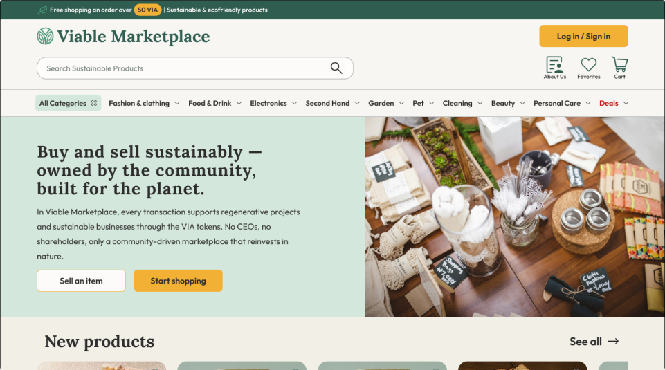
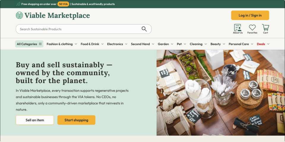
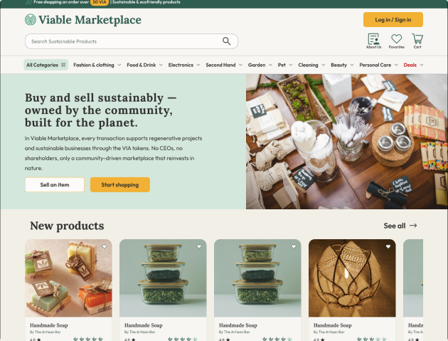
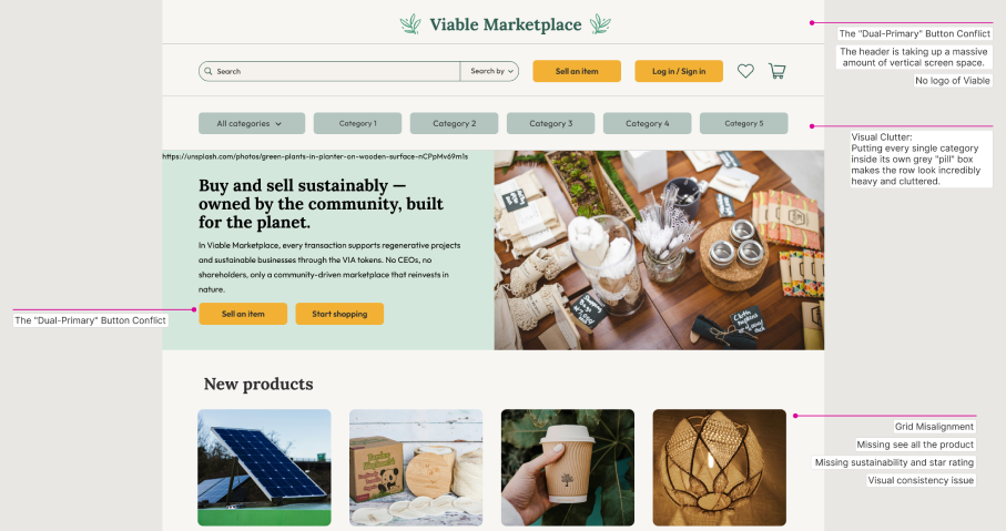
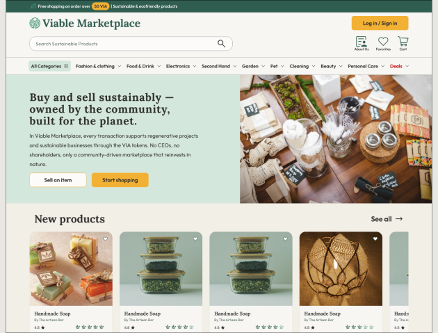
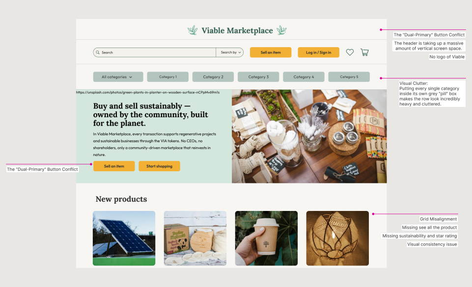
An audit of the existing storefront turned up smaller issues working against the trust and glanceability goals, the things a shopper registers before they ever reach a product card:
- Dual primary CTAs. "Sell an item" and "Log in / Sign in" competed for attention with no hierarchy, so I demoted "Sell an item" to a secondary outline style.
- No logo. A header that already took up a disproportionate share of the screen had no brand mark, so I added one.
- No category pills. Every category sat in its own grey pill, which read as clutter rather than navigation, so I flattened it into a simpler tab pattern.
- No incentive signal. Nothing up top gave shoppers a reason to trust the price, so I added a utility bar surfacing the free shipping threshold.
Outcome
What I learned
I contributed the card redesign and the Phase 1 research behind it, then handed off Phase 2 with the positioning statement and card system documented as the foundation for downstream decisions. The work didn't need me in the room to stay correct — that's the real test of research: not whether it holds up when you're there to defend it, but whether it still holds up when you're not.
The lesson for next time is about scope, not craft: define the handoff points before starting, not after.